How We Designed a FUN Nonfiction Book Cover
Every step and cover along the way
Before we start, David Perell, founder of Write of Passage, finished Crypto Confidential recently and described it as “destined to be a mega-hit” and “a masterpiece.” If you haven’t pre-ordered it yet, grab it now on Hardcover, Kindle, or Audible.
When I started working on the Crypto Confidential book cover with the Portfolio team, the most important rule I wanted to follow was:
Not boring.
Typical business and finance book covers are just dull. They have a couple safe formats they follow, and they all end up looking kind of the same.
That sameness isn’t necessarily bad. It sells, and it tells the reader what kind of book they’re getting.
But since Crypto Confidential wasn’t a “Crypto 101” book, I knew we couldn’t give it a typical “business book” cover. It needed to be clear this was a very different experience. It’s more action-packed:
"“Nat, someone found a way to hack us. It sounds bad. All of our funds might be at risk.”
This was the absolute worst-case scenario. The one I’d pushed to the back of my mind. The one I pretended was impossible so I could sleep at night. I’d always accepted the risk that I could lose all of my money. But if I lost a hundred million dollars of other people’s money …
I couldn’t let myself think about that right now.
I started running through every possible scenario. Whoever was reaching out might be trying to scam us, trying to trick us into doing something enabling him to hack us. Maybe he had already hacked us and was holding our money ransom? Or, maybe, just maybe, he was actually a trustworthy person and wanted to help us out?
Doubtful.
We needed a cover that matched its manic energy.
And so the adventure began, with its own set of emotional ups and downs along the way.
The Cover Brief
The first step in designing a cover with a publisher is the “cover brief,” a document where you give some initial guidance to their designers on how you want the cover to look.
At this step of the process, some authors will just hire an outside designer to do it. But I didn’t want to do that, because I had been so thoroughly impressed by my publisher so far that I trusted they could handle this part of the process too.
Here are the notes I sent them.
Significance or meaning of the title: It captures the Fear of Missing Out from being swept up in the financial mania around cryptocurrency from 2020 - 2022
Mood/tone: Fun, adventure, fish out of water, a little manic, excitement, determination
3-5 themes or descriptive words in order of importance to be conveyed by the cover:
Fear of Missing Out
Outsider / Chasing
Wealth
Suggested imagery (symbolic to the story or something you would like design to consider. Please attach any relevant images or visual inspiration. If there is any specific photographer/artist/designer, list here):
The Indiana Jones Raiders of the Lost Ark famous image where he’s stealing the golden idol
Countdown by Shanna Swan cover, the steps down image is powerful, we could do something similar with a rising graph that drops off at the end
“The big short” cover with the roll of money on a fishing hook
The theme of everyone getting rich at each others expense…
Occupy wall street image of standing at the base of some big building looking up, rich people drinking champagne and laughing down
Maybe the Catch Me If You Can poster?
Styles I DON’T like and want to avoid:
The big block text style everyone is doing, I think it’s overdone and doesn’t stand out anymore.
In retrospect, I should have included more details here. I could have spent more time to give them more to work with, but I was more focused on finishing the book and hoped this would be enough to get started.
The First Covers
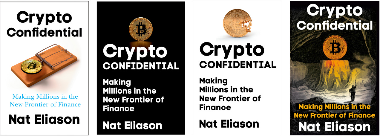
A few weeks later, the design team came back with their first ideas:
I was… not happy.
The first three were boring, and the Indiana Jones-esque one was kinda interesting, but the execution wasn’t there.
At this point I almost threw a fit. I was terrified that this fun exciting book was going to get stuck behind a boring cover. And it felt so far from the energy I wanted that I didn’t see what kind of feedback I could give them that would get it there.
But my editor, Noah, talked me down and said we needed to give them more guidance one what we were looking for. To be fair, I hadn’t given them that much to work with, and some what they came back with were pretty in line with the kinds of covers I described and referenced. I’d done a bad job guiding them.
Then he had a brilliant idea…
Using AI to Inspire the Cover Design
Noah hopped into Midjourney and started playing around and suggested I do the same.
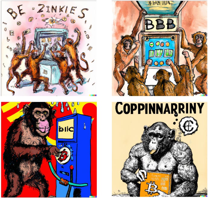
He came up with the idea of monkeys at the casino and sent me these graphics as some potential inspiration:
And honestly, I had a mixed reaction. I loved how fun and different it was. But I felt like it was too bright, too light. I still wanted something darker.
I skimmed through my bookshelf for other ideas and found Ryan Holiday’s Trust Me I’m Lying.
I adore this book cover, it captures the book's vibe perfectly. And it fits with the kind of mysterious energy I wanted.
I tried creating some designs in Midjourney based on it, but didn’t like anything I made. So we sent the designers this new feedback: something using the monkeys at the casino idea and something using the dark and mysterious noir vibe.
Round Two
A few weeks later, they came back with the next few ideas. Of them, these two were our favorites:
I LOVED both of these. The difference between the first attempts and these felt like night and day. I was honestly a little unsure which direction to go.
So I sent them to a bunch of friends to get their feedback. And the feedback was split too! Some people preferred the clarity and mystery of the redacted cover. Other people preferred the more manic monkey one.
This would have been an easy spot to take the path many nonfiction authors take: A/B testing. But I wasn’t sold on the normal advice to design dozens or hundreds of book cover variations and then run ads on them to see which gets the most clicks.
Might that find the most performant cover? Yes. But writing a book is an opinionated and artistic process. You should have as strong of an opinion on how it’s packaged as you do on how it’s written. You're no longer making art if you outsource your thinking to an A/B test. You’re treating it like a Facebook ad.
I got into this game to make books. Not Facebook ads.
So I picked the monkey cover, and we went ahead with that. There were still a few things we needed to fix, though:
The monkey was too hard to see. The cover didn’t have enough color. And most importantly, I still really didn’t like the big block text. It felt too sterile. Too “business-y.”
So I went back to my bookshelf to find more inspiration, and another book popped out at me: Fear and Loathing in Las Vegas.
The scratchy handwriting style was perfect, so I asked if we could do something more like that.
Round Three
A week or two later, they sent the next drafts:
NOW we were cooking. The email I sent Noah said “I’m grinning from ear to ear.” These were fantastic and so much fun, and the first one captured the vibe I was going for perfectly.
All I asked for at this point was to change how the “a” was drawn so it was a little clearer. And then we had our cover!
It will pop next to normal business nonfiction covers in a bookstore or on a list. It catches your eye on social media. It matches the energy of the book. It’s different. It’s bright. I can’t overstate how much I love this cover.
And looking back at where we started, it came such a long way.
If you’re designing a book cover in the future, I hope this glimpse into the process we followed is useful. And if there’s anything I didn’t mention, feel free to ask it in the comments.
Don’t forget to pre-order Crypto Confidential! If you send the receipt to cryptoconfidentialbook@gmail.com, I’ll send you the first two chapters immediately.


As a former graphic designer, it's fascinating to get the client's (your) perspective on this. Thanks for the behind the scenes look into your thought process. Good luck with the book!
I love the transformation.